
TL;DR:
- Color vibrancy defines the perceptual intensity or liveliness of a color, making it appear electric or dull. Unlike saturation, vibrancy selectively enhances muted tones for natural results, influencing emotional impact and visual focus. Achieving accurate vibrancy requires understanding color theory, careful calibration, and deliberate use of digital and physical media techniques.
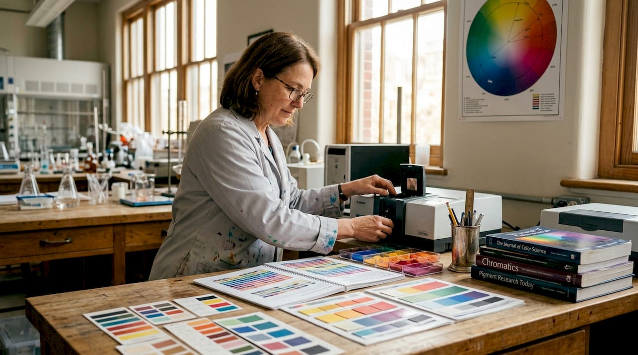
Color vibrancy is one of those concepts most designers think they understand until they actually try to explain it. Many creatives use “vibrancy” and “saturation” interchangeably, which leads to blown-out colors, unnatural results, and a general frustration with why nothing looks quite right. So what is color vibrancy, exactly? At its core, it refers to the perceptual intensity or liveliness of a color, a quality that determines whether a color reads as electric and alive or dull and flat. Understanding this distinction gives you real creative control, whether you’re editing photos, designing apparel, or working with physical paints.
Table of Contents
- Key takeaways
- What is color vibrancy: the science behind it
- Vibrancy vs. saturation: clearing up the confusion
- How vibrancy shapes mood and visual impact
- Techniques for enhancing color vibrancy in your work
- My take on mastering vibrancy
- Get vibrant, accurate color with Transferkingz
- FAQ
Key takeaways
| Point | Details |
|---|---|
| Vibrancy is perceptual intensity | Color vibrancy measures how pure or alive a color appears, not just how bright or saturated it is. |
| Saturation and vibrance are different tools | Saturation boosts all colors uniformly; the vibrance tool selectively targets muted areas for balanced results. |
| Context changes perceived vibrancy | Placing a color next to neutrals or complements makes it appear more vibrant without changing the color itself. |
| Vibrancy drives emotional response | High-chroma colors trigger physiological arousal and can significantly influence consumer behavior and viewer attention. |
| Print workflows demand vibrancy precision | Maintaining color vibrancy across digital files and physical prints requires calibrated profiles and quality inks. |
What is color vibrancy: the science behind it
Color vibrancy is the perceptual intensity of a color, describing how vivid or pure it appears to the human eye. Professionals sometimes call this quality “chroma” or “intensity,” and it sits alongside hue (the color itself) and value (its lightness or darkness) as one of the three fundamental dimensions of color. Strip away the chroma from any color, and you push it toward gray. Add it back, and the color practically jumps off the surface.
Here is a practical way to think about it. Cadmium red at full vibrancy is an arresting, almost aggressive color. Reduce its chroma while keeping the hue and value constant, and you get a dusty, muted rose. The hue never changed. The value barely shifted. Only the vibrancy moved.
How vibrancy is measured
Professional color scientists use the Munsell system and perceptually uniform spaces like CIELAB to quantify vibrancy. The CIELCH color model separates lightness, chroma, and hue into independent channels, which is exactly why it’s the preferred model for anyone who needs precise, device-independent vibrancy control. It removes the guesswork.
Here is a quick comparison of low and high vibrancy characteristics:
| Characteristic | Low vibrancy | High vibrancy |
|---|---|---|
| Chroma value | Low, closer to gray | High, fully saturated |
| Emotional tone | Calm, subdued, sophisticated | Energetic, bold, attention-grabbing |
| Common use | Background elements, skin tones | Hero elements, CTAs, branding |
| Visual effect | Recedes in space | Advances toward the viewer |
Key properties of vibrant colors that matter in creative work:
- They naturally create focal points without any other design intervention.
- They respond strongly to adjacent colors, either amplifying or dulling based on context.
- They carry more psychological weight and tend to trigger stronger emotional associations.
- They are harder to reproduce accurately across different media, especially print.
Vibrancy vs. saturation: clearing up the confusion
This is where most creative professionals go wrong. Saturation and vibrancy are related concepts, but they describe different things and behave differently as editing tools.
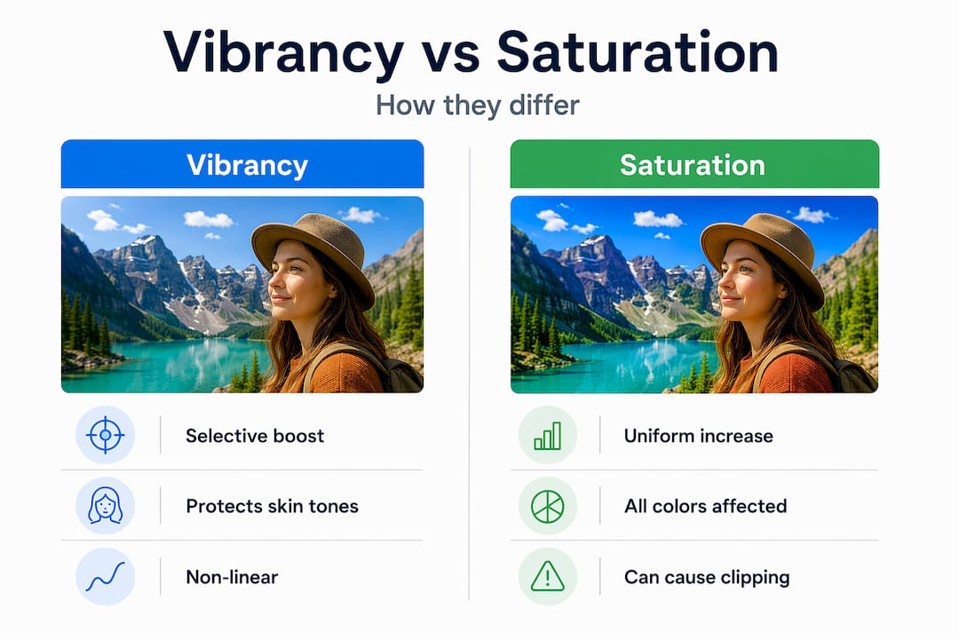
Saturation, as a slider in any photo editing or design application, applies a uniform boost to all colors in an image. It doesn’t discriminate. Push it too far, and already-rich colors clip into neon territory while skin tones turn orange and shadows go radioactive. Overusing the saturation slider causes exactly this kind of unnatural result, and beginners often don’t realize the damage until they print.
The vibrance tool works differently by design. It’s a non-linear, selective algorithm. The vibrance tool boosts muted colors while leaving already-saturated areas and skin tones largely untouched. The result is a more balanced, natural-looking enhancement, which is why portrait photographers strongly prefer it over raw saturation adjustments.
When to use each
The decision comes down to intent:
- Use vibrance when you want to lift dull areas of a photo or design without making the overall image feel over-processed. It’s the safer choice for portraits, lifestyle imagery, and any situation where naturalism matters.
- Use saturation when you want a deliberate, dramatic color shift across the whole image. It works well for landscapes, graphic design, and stylized artwork where maximum intensity is the goal.
Pro Tip: Before touching either slider, pull up the histogram and keep an eye on the highlights. If you see the ends clipping when you raise saturation, switch to vibrance immediately.
A practical comparison to keep in your workflow:
| Scenario | Best tool | Why |
|---|---|---|
| Portrait retouching | Vibrance | Protects skin tones, avoids clipping |
| Product photography | Saturation (subtle) | Even boost across product colors |
| Landscape photography | Both, in layers | Saturation for sky, vibrance for foliage |
| Digital apparel design | Vibrance first | Balanced intensity without blowout |
How vibrancy shapes mood and visual impact
Color vibrancy is not just a technical property. It’s a psychological lever. Vibrant colors increase physiological arousal and emotional engagement, which is why brands competing for shelf space or screen attention consistently use high-chroma palettes for hero elements. The connection is well-documented: 85% of consumers cite color as their primary reason for choosing a product.
But vibrancy is not always about turning everything up. The most sophisticated visual communication uses contrast between vibrant and muted areas. A single vibrant accent color on a neutral background carries far more weight than an image where everything is screaming for attention. Muted backgrounds make vibrant elements advance visually, creating depth and directing the viewer’s eye exactly where you want it.
“Color is the keyboard, the eyes are the harmonies, the soul is the piano with many strings.” — Wassily Kandinsky
The psychological impact of vibrancy depends heavily on the specific hue. High-chroma yellows and oranges read as energetic and approachable. Vibrant blues and purples carry authority or mystery depending on context. Red at full vibrancy signals urgency, passion, or danger. These associations are deeply cultural and contextual, but the underlying principle holds: more vibrancy means more emotional force.
Strong applications of vibrancy in professional creative work include:
- Brand identity design: Brands like sports apparel companies and fast-food chains use maximum chroma to trigger excitement and hunger cues.
- Event promotion graphics: High-vibrancy color schemes create urgency and excitement in a glance.
- DTF and custom apparel printing: Vibrant color execution on garments turns artwork into a wearable focal point.
Techniques for enhancing color vibrancy in your work
Understanding vibrancy conceptually is useful. Knowing how to actually increase it in your creative work is where the real payoff comes. These techniques apply whether you’re working in digital software or with physical media.
-
Use complementary color contrast. The color relativity phenomenon means a color’s perceived vibrancy shifts based on what sits next to it. A green placed next to its complement, red, appears far more intense than the same green on a white background. You can make colors look more vibrant without changing their actual saturation value.
-
Work on a neutral or desaturated background first. When building a composition, keep your canvas or artboard neutral gray while color-checking key elements. This prevents your eye from adapting to surrounding colors and gives you an honest read of each element’s vibrancy.
-
Understand your color space. Digital RGB mixing differs fundamentally from physical pigment mixing. On screen, mixing red and green creates yellow. With paint, you get mud. This means digital artists can push vibrancy much further in RGB than would ever be achievable with physical media, but they also need to account for the translation loss when files go to print.
-
Use the CIELCH model for precision editing. If your software supports it, CIELCH lets you adjust chroma independently without accidentally shifting the hue or lightness. This is the most controlled way to increase vibrancy, especially when color accuracy matters across different output devices.
-
Calibrate your monitor and use ICC profiles. Precise color calibration is non-negotiable if you want what you see on screen to match what comes out of a printer or transfer press. Uncalibrated monitors routinely display colors as far more vibrant than they actually are, which leads to disappointing print results.
-
Choose your inks and substrates deliberately. For physical printing, the substrate surface and ink formulation directly affect vibrancy. Matte surfaces absorb light and reduce perceived chroma. Glossy or poly-blend fabrics allow inks to sit on the surface and reflect light, which amplifies vibrancy significantly.
Pro Tip: When preparing artwork for DTF transfers specifically, always convert your working file to the correct color profile before sending to print. A file built in sRGB will behave differently than one in AdobeRGB, and the difference shows up most dramatically in your most vibrant hues. Check out this guide on vibrant color printing for artists to dial in your pre-press workflow.
My take on mastering vibrancy
I’ve watched a lot of talented designers plateau creatively because they treat vibrancy as a slider, not a decision. The instinct is to push saturation up when colors look flat. It’s fast, it’s obvious, and it almost always produces results that look processed rather than intentional.
In my experience, the creatives who produce genuinely arresting work understand one thing that textbooks rarely emphasize: restraint is where vibrancy gets its power. I’ve seen artwork completely transform when someone pulled back 80% of the colors to near-neutral tones and let a single high-chroma element carry the composition. The vibrant color didn’t get more saturated. It got more room.
Technology tools like vibrance sliders and CIELCH editors are genuinely useful, but they also create a false sense of control. Real vibrancy mastery comes from training your eye to perceive chroma the way it actually interacts with adjacent colors, light conditions, and output media. The only way to build that skill is to experiment obsessively, print your work, and compare what you intended to what you actually got. The gap between those two things is your curriculum.
— Anthony
Get vibrant, accurate color with Transferkingz
If you’ve made it this far, you understand that color vibrancy is not an accident. It’s a deliberate creative choice that requires the right knowledge AND the right production partner.
At Transferkingz, every DTF transfer is produced with premium inks and precision-calibrated film technology specifically designed to reproduce high-chroma colors with accuracy. Whether you’re printing a bold streetwear graphic or a detailed full-color illustration, the production process is built to honor the vibrancy in your original artwork. Explore the Print Point solutions to see how the print workflow is optimized for color fidelity. You can also learn how DTF handles intricate prints without sacrificing the saturation and detail in complex artwork. For a deeper dive into maintaining consistent vibrant prints throughout your production runs, the Transferkingz blog covers the full technical workflow.
FAQ
What is the definition of color vibrancy?
Color vibrancy refers to the perceptual intensity or purity of a color, often called chroma. A high-vibrancy color appears vivid and alive, while a low-vibrancy color looks muted or grayish, even if the hue remains the same.
How is color vibrancy different from saturation?
Saturation uniformly increases the intensity of all colors in an image, which can cause clipping and unnatural results. Color vibrancy, as a perceptual quality, describes how alive a specific color reads to the eye, while the vibrance tool selectively targets only muted colors for a more balanced effect.
What affects color vibrancy in design?
Adjacent colors, background tone, substrate surface, ink quality, and monitor calibration all affect how vibrant a color appears. Placing a color next to its complement or a neutral background significantly increases its perceived vibrancy without altering its actual saturation value.
How do I enhance color vibrancy without over-processing?
Use the vibrance slider instead of saturation for selective boosts, work with complementary color contrast, and calibrate your monitor with accurate ICC profiles. For print work, choosing high-quality inks and appropriate substrates will preserve the chroma your digital file specifies.
Why does color vibrancy matter in printing?
Printed colors behave differently than screen colors because physical inks and substrates absorb and reflect light in ways that RGB displays do not replicate. Maintaining vibrancy through the print process requires correct color profiles, calibrated equipment, and quality production materials to avoid colors that look flat or shifted compared to the original design.
0 comments