
TL;DR:
- Color management ensures consistent and accurate colors across devices using ICC profiles, calibration, and soft proofing. Calibration with hardware tools is essential for maintaining reliable color reproduction in monitors and printers, preventing costly errors. Applying a systematic workflow enhances print predictability, saves money, and improves visual consistency for professional designs.
Color management is a system that ensures colors stay consistent and predictable across every device in your creative workflow, from monitor to printer to final output. Without it, the vivid red you see on screen can print as a muddy orange, and a carefully crafted brand palette can shift unpredictably between print runs. Understanding color management means knowing how ICC profiles, color spaces, and calibration tools work together to translate color accurately. This guide covers the core mechanics, the critical role of calibration, common pitfalls, and practical steps you can apply in Adobe Photoshop, Illustrator, or any professional print workflow today.
How does a color management system actually work?
A color management system is a mathematical translation engine. It converts color data from one device’s native language into a shared reference space, then translates it again into the output device’s language. The result is that a blue on your monitor and a blue on your printer describe the same color, even though those two devices produce color in completely different ways.
The foundation of this system is the ICC profile. ICC profiles standardize device color descriptions, mapping each device’s characteristics to a common reference color space called CIELAB. CIELAB is device independent, meaning it describes color the way human vision perceives it, not the way a specific machine produces it.
Three core components make the system run:
- Color spaces: RGB (used by monitors and cameras), CMYK (used by most commercial printers), and CIELAB (the neutral reference space). Each defines a range of reproducible colors called a gamut.
- ICC profiles: Files that describe how a specific device captures or reproduces color. Every calibrated monitor, scanner, and printer has one.
- Color management modules (CMMs): The software engines that perform the actual conversion. Common color engines include Adobe ACE, Apple ColorSync, and Windows ICM, each handling the math of translating colors between profiles.
When you send a file to print, the CMM reads the source ICC profile embedded in your file, converts the colors through CIELAB, and then maps them to the printer’s output profile. The rendering intent you choose, such as Perceptual or Relative Colorimetric, determines how out-of-gamut colors are handled during that conversion. Perceptual compresses the entire gamut to fit, preserving relationships between colors. Relative Colorimetric clips out-of-gamut colors to the nearest reproducible value, keeping in-gamut colors exact.
Understanding this pipeline is the first step toward controlling your output rather than hoping for the best.
Why are calibration and profiling non-negotiable?
Calibration and profiling are two separate steps, and skipping either one breaks the entire system. Calibration resets a device to a stable, known state, while profiling measures and records how that device actually reproduces color at that stable state. Profiling without calibration is useless because the profile only reflects the device’s behavior at the moment of measurement. If the device drifts, the profile becomes inaccurate.
Monitors drift over time. Backlights age, color temperature shifts, and brightness changes. Professional workflows recommend monthly monitor calibration using hardware tools like colorimeters to catch and correct that drift before it affects your work.
Why hardware beats software for calibration
Software calibration tools that rely on your eyes are not reliable. Hardware colorimeters deliver repeatable calibration results that software tools dependent on human perception cannot match. The human eye adapts to ambient lighting within seconds, making it impossible to judge absolute color values objectively. A colorimeter measures actual light output from your monitor and generates a correction curve based on real data, not perception.
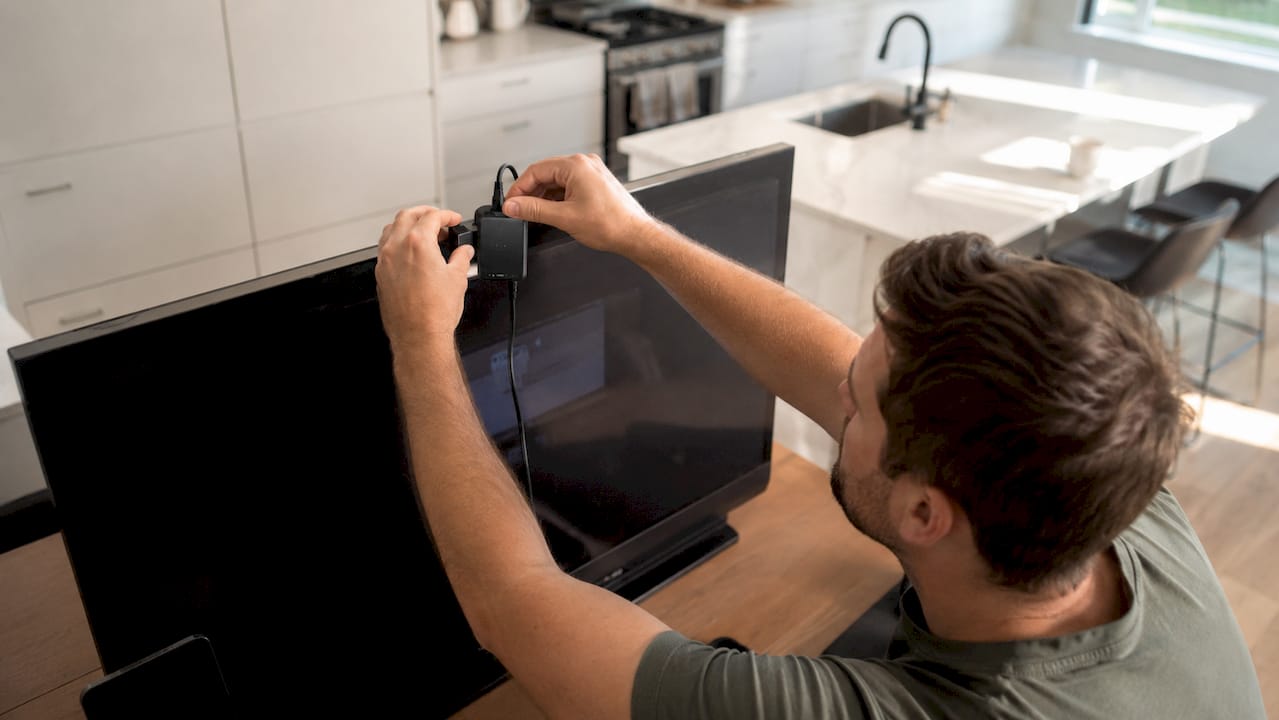
Hardware-based calibration outperforms software methods by objectively measuring light output and preventing failures like color clipping. Devices like the X-Rite i1Display Pro or Datacolor Spyder X Pro are the standard tools for monitor profiling in professional design and photography workflows.
Pro Tip: Calibrate your monitor in the same lighting conditions you use for design work. Ambient light affects how you perceive the screen, so consistency in your environment matters as much as the calibration hardware itself.
For printers, profiling requires a spectrophotometer. You print a standardized color target, measure each patch with the spectrophotometer, and the profiling software builds an ICC profile from those measurements. This profile tells your color management system exactly how that printer, with those inks and that paper, reproduces color.
What are the biggest color management challenges?
Even with a solid system in place, several problems appear regularly in creative workflows. Knowing what they are and how to handle them saves you from expensive reprints and client frustration.
Gamut mismatch is the most common issue. Monitors rely on RGB light with a wider gamut than printers using CMYK inks, which means some colors you see on screen simply cannot be reproduced in print. Saturated blues and electric greens are frequent casualties.
The table below shows the most common challenges and the standard approach for each:
| Challenge | What Causes It | How to Handle It |
|---|---|---|
| Out-of-gamut colors | RGB monitor gamut exceeds CMYK printer gamut | Use Perceptual rendering intent; soft proof before sending to print |
| Untagged files | Missing embedded ICC profile in source file | Always embed the working space profile when saving files |
| Metamerism | Colors match under one light source but not another | Test proofs under multiple light sources; use standardized viewing booths |
| Profile mismatch | Source and output profiles conflict | Assign the correct profile at file creation; convert, do not assign, when changing spaces |
| Inconsistent print runs | Printer not recalibrated between jobs | Recalibrate and reprint test targets before long production runs |
Metamerism catches many designers off guard. Two colors can look identical on screen or under one light source but appear completely different under another. This happens because different colorants can produce the same visual response under one illuminant but diverge under another. Standardized viewing booths with D50 or D65 illuminants are the professional solution.
Without embedded ICC profiles, print devices must guess color values, risking inaccurate reproductions. Always embed your working space profile when saving files for print. In Adobe Illustrator and Photoshop, this is a checkbox in the Save As dialog. It takes two seconds and prevents a category of errors entirely.
Soft proofing simulates print output gamut on screen to prevent surprises at the press. In Photoshop, View > Proof Colors activates soft proofing using your selected output profile. Use it before finalizing any design intended for print.
How do you apply color management in real workflows?
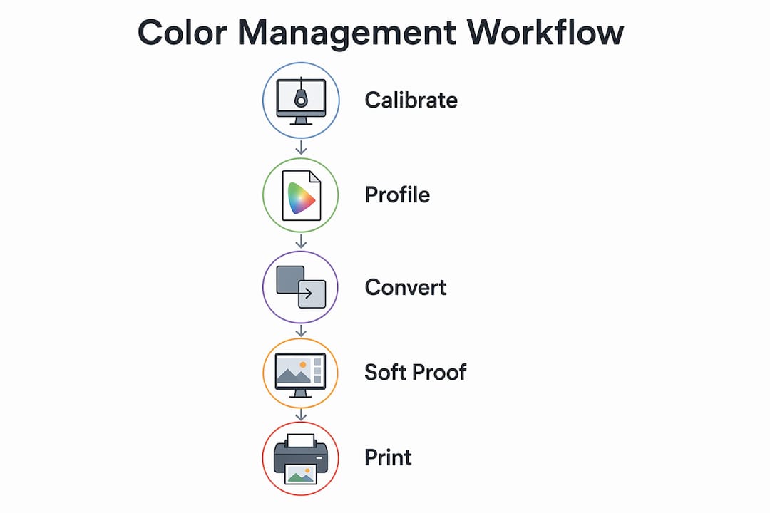
Knowing the theory is one thing. Applying it in a live design or print workflow is where color management pays off. Here is a practical sequence for setting up a color-managed workflow from scratch:
- Calibrate your monitor using a hardware colorimeter like the X-Rite i1Display Pro. Set your target white point to D65 (6500K) for general design work or D50 (5000K) if your work is primarily for print evaluation.
- Profile your output devices. Print a color target on each printer and paper combination you use, measure it with a spectrophotometer, and generate an ICC profile using software like X-Rite i1Profiler or Datacolor SpyderPrint.
- Configure your software color settings. In Adobe Photoshop, go to Edit > Color Settings. Set your RGB working space to Adobe RGB (1998) for print work or sRGB for web output. Assign CMYK profiles that match your print provider’s specifications.
- Embed profiles in every file. Never send an untagged file to a printer. Embed the correct ICC profile at export, whether you are exporting a PDF from InDesign or a TIFF from Photoshop.
- Soft proof before finalizing. Use Photoshop’s or Illustrator’s soft proofing tools to simulate your output device’s gamut. Adjust colors that fall outside the printable range before sending the file.
- Verify output. After printing, compare the output to your soft proof under a standardized light source. If they match, your workflow is dialed in. If they do not, recheck your printer profile and calibration.
Color management reduces costly reprints and customer complaints by eliminating unpredictable color shifts between print runs. For a small print shop or freelance designer, even one avoided reprint per month justifies the investment in calibration hardware.
Pro Tip: Set a calendar reminder to recalibrate your monitor every 30 days. Monitors drift gradually, so the change is invisible day to day but significant over a month. Consistent recalibration keeps your profiles accurate and your color decisions trustworthy.
Adobe recommends using soft proofing to approximate print output on screen, helping designers anticipate print color limitations before a single sheet is printed. This is not optional for professional print work. It is the difference between a predictable result and a costly surprise.
For designers working with DTF printing specifically, understanding how your color workflow connects to the printer’s ICC profiles is critical. The DTF color accuracy guide from Transferkingz covers calibration and profiling steps specific to apparel decoration workflows.
Key takeaways
Accurate color reproduction requires calibration, ICC profiles, and soft proofing working together as a system, not as isolated steps.
| Point | Details |
|---|---|
| ICC profiles are the foundation | They map device color behavior to CIELAB, enabling accurate cross-device translation. |
| Calibration precedes profiling | A profile is only valid for the device state at the time of measurement; calibrate first. |
| Hardware beats human perception | Colorimeters and spectrophotometers measure objectively; eyes adapt and mislead. |
| Embed profiles in every file | Untagged files force printers to guess, producing inaccurate and unpredictable output. |
| Soft proofing prevents reprints | Simulating print gamut on screen catches out-of-gamut colors before they reach the press. |
Color management is both art and money
Here is the honest truth most articles skip: color management is not just a technical checkbox. It is a financial decision. Every reprint you avoid, every client revision you prevent, and every production run that ships correctly the first time is money you keep.
I have seen designers invest thousands in premium monitors and then calibrate them with their eyes. That is like buying a precision scale and estimating weight by feel. The hardware investment only pays off when the calibration process is objective. A colorimeter costs less than one reprint job. That math is not complicated.
The other thing creatives underestimate is the compounding effect of a bad workflow. One uncalibrated monitor affects every file you produce on it. One missing ICC profile in a template gets copied into dozens of jobs. Color management is both an artistic and financial strategy, and the cost of ignoring it scales with your output volume.
My advice: start with your monitor. Get it calibrated with hardware this week. Then profile your most-used printer and paper combination. You do not need a perfect system on day one. You need a better system than yesterday’s. The printing workflow checklist from Transferkingz is a practical starting point if you want a structured sequence to follow.
Color management is not a skill reserved for prepress specialists. It is the baseline for any creative professional who wants their work to look the same in print as it does on screen.
— Anthony
Get color-accurate DTF prints with Transferkingz
Color accuracy in Direct-to-Film printing depends on the same principles covered in this guide: calibrated equipment, accurate ICC profiles, and a controlled production workflow. Transferkingz builds these standards into every order, using professional-grade inks and films calibrated for consistent, vibrant color reproduction across apparel and merchandise.
Whether you are a graphic designer sending files for the first time or a print shop scaling up production, Transferkingz handles the color workflow so your designs print exactly as intended. Explore custom DTF printing services and see what a color-managed production process delivers for your next project.
FAQ
What is color management in simple terms?
Color management is a system that uses ICC profiles and calibration to keep colors consistent across different devices like monitors, scanners, and printers. It translates color data so what you see on screen matches what comes out of the printer.
What is the difference between calibration and profiling?
Calibration resets a device to a stable, known state, while profiling measures and records how that device reproduces color at that state. Both steps are required because a profile is only accurate for the device’s condition at the time it was created.
Why do colors look different on screen vs. in print?
Monitors produce color using RGB light with a wider gamut than CMYK printers, so some screen colors fall outside what a printer can reproduce. Soft proofing in software like Adobe Photoshop simulates the printer’s gamut on screen to help you identify and adjust those colors before printing.
How often should i calibrate my monitor?
Professional workflows recommend calibrating your monitor monthly using a hardware colorimeter. Monitors drift over time as backlights age, and monthly calibration catches that drift before it affects your color decisions.
Do i need to embed ICC profiles in my files?
Yes. Without an embedded ICC profile, print devices must guess color values, which produces inaccurate and unpredictable output. Always embed your working space profile when saving files for print in applications like Adobe Photoshop, Illustrator, or InDesign.
0 comments