

Calibrate your workflow, match your paper to a proper ICC profile, soft-proof before you commit, and run one pattern print to verify. That four-step sequence delivers the biggest, fastest gains when you want to optimize color vibrancy in prints. Everything else is refinement.
Here is a quick-action checklist you can run through right now:
- Calibrate your monitor using a hardware colorimeter (X-Rite ColorMunki or Datacolor Spyder) and re-profile every 3–6 months
- Install the paper-specific ICC profile for your printer/paper combination before you open the file
- Convert using the correct rendering intent (Perceptual for saturated images, Relative Colorimetric for neutrals)
- Choose coated or high-gamut media over uncoated stock when vibrancy is the priority
- Run a single-sheet pattern print with incremental adjustments before committing to a full production run
- Aim for 300 DPI minimum resolution for photographic or detail-heavy artwork
Pro Tip: If you skip the pattern print, you are essentially paying full production price for a guess. One test sheet costs almost nothing compared to reprinting a full job.
The International Color Consortium (ICC) profile standard, the G7 gray-balance specification, and the 300 DPI resolution floor are three benchmarks that separate predictable vibrancy from luck. Transferkingz builds its DTF transfer workflow around all three.
Key Takeaways
Predictable vibrancy requires a calibrated system, not a single setting: calibrate your monitor, match your ICC profile to your paper, soft-proof before converting, and verify with a pattern print before every production run.
| Point | Details |
|---|---|
| Calibrate monitor and profile | Use X-Rite ColorMunki or Datacolor Spyder; re-profile every 3–6 months and set brightness to ~120 nits. |
| Edit wide, convert late | Work in Adobe RGB or ProPhoto RGB; convert to output CMYK only at the final step with the correct ICC loaded. |
| Paper and ink drive gamut | Coated/gloss media and extended-gamut (7-color) ink sets deliver the highest perceived saturation. |
| Pattern print before production | Print a thumbnail grid with incremental adjustments; confirm the best patch before committing to a full run. |
| DTF needs substrate specs | White underbase density and substrate color determine DTF vibrancy more than any file-level color adjustment. |
Table of Contents
- How does the 6 C’s framework help you get consistent vibrancy?
- Why does monitor calibration matter so much for print results?
- How should you prepare source files to protect vibrancy?
- How do you convert to CMYK and soft-proof without losing vibrancy?
- Which paper, ink, and printer choices actually move the needle on vibrancy?
- What RIP and printer driver settings increase saturation without breaking neutrals?
- How do pattern prints and hard proofs lock in your settings?
- What causes dull or shifted prints, and how do you fix them fast?
- Preflight checklist before you send to production
- How does this workflow apply specifically to DTF transfers and apparel?
- The part most guides skip
- Sources
How does the 6 C’s framework help you get consistent vibrancy?
Vibrancy is a system property. Change one variable in isolation and you might see a small improvement. Build a consistent system and the gains compound across every job. The 6 C’s of Color Management from Printing.org frames it exactly that way: Consistency, Calibration, Characterization, Conversion, Control, and Conformance. Each C is a checkpoint in the workflow from screen to substrate.
Think of it as a three-step flow: Calibrate → Prepare files and proof → Print and verify. Every one of the 6 C’s maps to one of those three stages. Skip a stage and you introduce a variable you cannot predict or repeat.
The table below maps each workflow stage to its difficulty, typical cost, and impact on perceived vibrancy. Use it to decide where to invest first.
| Workflow stage | Difficulty | Cost | Impact on vibrancy |
|---|---|---|---|
| Monitor calibration (Calibrate) | Low | hardware | High |
| ICC profile installation (Characterize) | Low | Free (download) | High |
| Rendering intent + soft proof (Convert) | Medium | Free (software) | Medium–High |
| Paper/media upgrade (Control) | Low | Low–Medium | High |
| RIP/driver saturation settings (Control) | Medium | Free–RIP license | Medium |
| Pattern print verification (Conformance) | Low | Cost of one sheet | High |
The color management role in design and print post on the Transferkingz blog expands on how each stage connects to real production decisions.
Why does monitor calibration matter so much for print results?
Your monitor is the first place a color decision gets made. If it is lying to you about saturation, brightness, or white point, every correction you make downstream is compensating for a problem you cannot see. A calibrated display is not a luxury for pros; it is the only way to make screen-to-print predictions that hold up.
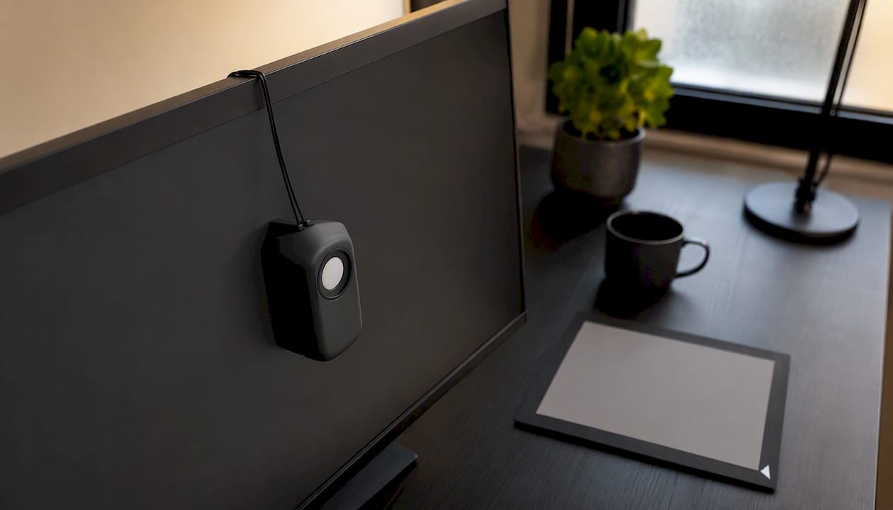
Hardware colorimeters are the standard tool here. X-Rite ColorMunki and Datacolor Spyder are the two most widely used options in the US market. Both measure your display’s actual output and generate a custom ICC monitor profile that corrects for drift. For production work, re-profile every 3–6 months; consumer LCD panels drift faster than that, so quarterly is a reasonable cadence if you are printing jobs where color accuracy is billable.
Brightness is where most people get tripped up. Monitors shipped from the factory often run at 200–300 nits, which looks great in a bright showroom but makes prints look dark by comparison. A print-appropriate starting point is around 120 nits, with your white point set to D50 (5000K) to match standard print-viewing conditions. If you evaluate prints under cool fluorescent or mixed office lighting, you will consistently judge them as too warm and over-correct.
Canon’s guidance on colour calibration makes a point worth repeating: modern wide-gamut monitors can display colors that no inkjet or press can reproduce. That gap is not a failure of the printer. It means your soft proof will always look duller than your raw RGB file, and that is correct behavior. Plan for it rather than chasing it with global saturation sliders.
- Set display brightness to approximately 120 nits for print work
- Use D50 (5000K) white point and evaluate prints under the same color temperature
- Install printer-specific ICC and AM1X files where the manufacturer provides them (Canon imagePROGRAF printers ship with both)
- Re-profile your monitor on a schedule, not just when something looks wrong
How should you prepare source files to protect vibrancy?
File preparation is where vibrancy gets quietly destroyed before a single drop of ink hits paper. Wrong color space, low resolution, or a flattened file with no embedded profile all cost you gamut before the job even reaches the printer.
Resolution: Target 300 DPI for photographic and detail-heavy artwork. For logos and solid-color graphics, use vector formats (EPS, AI, SVG) so edges stay crisp at any output size without rasterization artifacts that muddy color boundaries.
Color space: Edit in a wide working space. Adobe RGB covers a substantially larger gamut than sRGB, and ProPhoto RGB covers more still. Keep your edits in Adobe RGB or ProPhoto while you are making color decisions; only convert to the output profile (CMYK or printer RGB) at the final step. Converting early compresses your gamut before you have finished adjusting.
Bit depth: Use 16-bit when you expect heavy color correction. Aggressive curves or saturation moves on an 8-bit file create banding in smooth gradients, which reads as dull or dirty color in print. Flatten to 8-bit only when the file is final and the profile is embedded.
File formats: TIFF and PSD preserve layers, bit depth, and embedded profiles. EPS handles vector separations cleanly. Avoid JPEG for production files; its lossy compression degrades color accuracy in subtle gradients and near-neutral tones.
| File parameter | Recommended setting | Why it matters for vibrancy |
|---|---|---|
| Resolution | 300 DPI minimum | Preserves fine detail; prevents muddy edges |
| Working color space | Adobe RGB or ProPhoto RGB | Wider gamut for editing headroom |
| Bit depth | 16-bit during editing | Prevents banding in gradients |
| Output format | TIFF or PSD (production), EPS (vector) | Preserves profile and layer data |
| Embedded profile | Always embed on export | Prevents color-space misinterpretation |
A quick preflight pass should also catch: fonts not outlined or embedded, missing bleed, active transparency that flattens unexpectedly on export, and overprint settings that can shift color in dark areas. These are not glamorous checks, but each one can produce a color shift that looks like a vibrancy problem when it is actually a file problem.
How do you convert to CMYK and soft-proof without losing vibrancy?
The short answer: stay in RGB as long as possible, soft-proof with your target ICC loaded, make selective corrections in RGB or Lab before you convert, and only commit to CMYK at the final output step. That sequence preserves the most gamut and gives you the most control.
Adobe Photoshop’s soft-proofing workflow is the standard reference here. In Photoshop, go to View > Proof Setup > Custom, load your printer/paper ICC profile, enable Simulate Paper Color, turn on Black Point Compensation, and leave Preserve RGB Numbers off. What you see is a realistic simulation of how the print will look. It will appear duller than your RGB original. That is not a bug; it is the gamut difference between your display and the press.
Rendering intent is the decision that most affects how out-of-gamut colors land:
- Perceptual: Compresses the entire gamut to fit the output space, preserving color relationships. Best for photographs and highly saturated images where you want the overall feel to hold even if individual values shift.
- Relative Colorimetric: Clips out-of-gamut colors to the nearest reproducible value and leaves in-gamut colors unchanged. Better for neutral or pastel images where gradation accuracy matters more than saturation. Red River’s rendering intent guide covers the practical trade-offs clearly.
Once you see the soft proof, resist the urge to drag the global Saturation slider. Instead, use Selective Color or Hue/Saturation targeted to specific channels (boost the Reds, pull the Cyans, whatever the image needs) while still in RGB. Printing.org’s selective color correction guidance makes the case that targeted hue adjustments fix off-colors without damaging neutrals or skin tones, which a global saturation boost will always compromise.
The areas that shift most are your problem zones — fix them in RGB before the final conversion, not after.*
Which paper, ink, and printer choices actually move the needle on vibrancy?
Paper surface is the single biggest variable most designers underestimate. A coated gloss or semi-gloss stock keeps ink on the surface, producing sharper dot edges, higher optical density, and more saturated color. Uncoated stock absorbs ink into the fiber, spreading the dot and reducing contrast. The same file, the same printer, the same ink set — and the coated version will look noticeably more vibrant.
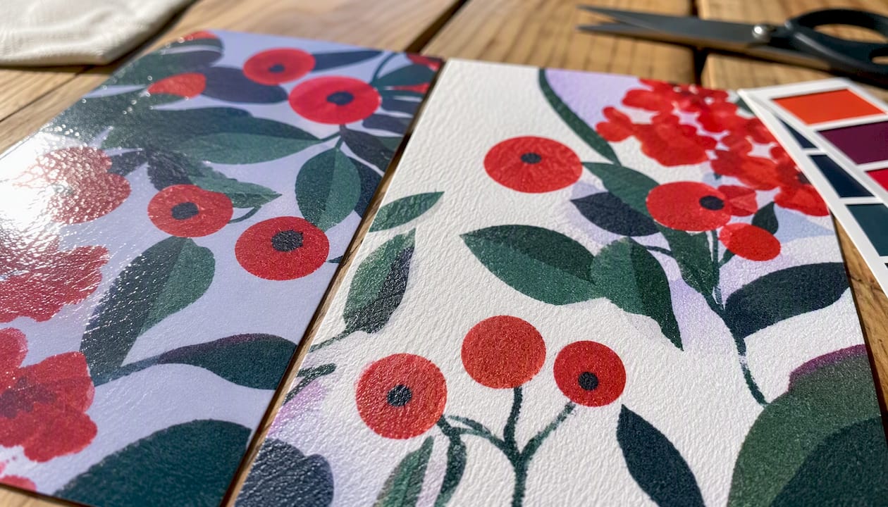
Ink sets and gamut: Standard four-color CMYK has a fixed gamut ceiling. Adding Orange, Green, and Violet inks (extended-gamut or 7-color processes) pushes well past that ceiling. A 7-color extended-gamut process can reach over 85% of the Pantone gamut, compared to roughly 50–55% for standard CMYK on coated stock. For brand colors, packaging, or any job where a specific hue must pop, extended gamut is worth the conversation with your print provider.
Spot colors vs. process: Pantone spot inks are mixed to a precise formula and can hit colors that no CMYK combination reaches. The trade-off is cost and press complexity. For short-run digital work, extended-gamut process is usually the practical answer. For brand-critical colors on long runs, spot is still the gold standard.
Dot gain is the other side of the ink equation. In high-density areas, ink dots spread and merge, which compresses shadow detail and makes dark areas look muddy rather than rich. Professionals compensate by pulling back ink density slightly in near-solid areas. The dot gain behavior documented by UH is a useful reference for understanding how to set ink limits in your ICC profile or RIP.
- Coated/gloss media: highest perceived saturation, sharpest dot, best for photography and brand color work
- Matte coated: softer look, lower glare, still significantly better than uncoated for vibrancy
- Uncoated: lower gamut, higher dot gain; use only when the tactile quality of the stock outweighs the color trade-off
- Extended-gamut (7-color) presses: best option when standard CMYK cannot hit a required hue
What RIP and printer driver settings increase saturation without breaking neutrals?
RIP software gives you more control over color behavior than a standard printer driver, and the difference shows up most in saturated colors and neutrals. The key settings to know:
Clean Colors / Intensify and Clean: Fiery Command WorkStation offers a color-optimization workflow that removes spectral impurities from process inks and, with the Intensify option, selectively boosts saturation up to a defined threshold. The result is cleaner, more saturated color without the gray cast that contaminated inks introduce. For banners and posters where vibrancy is the primary goal, automatic cleaning is a reliable starting point.
Black handling: Set black to print as inkjet black (K-only) rather than a rich black mix in areas where neutrality matters. A rich black built from all four channels can shift toward warm or cool depending on ink balance, which reads as a color cast in what should be neutral shadows.
Ink limiting: Over-inking causes dot gain, slow drying, and muddy color in dark areas. Your RIP’s total ink limit (TAC) should be set to match your paper’s absorption capacity. Coated stock typically handles a higher TAC than uncoated.
Device vividness settings: Some Canon devices include built-in vividness levels (Standard, Level 1, Level 2) that increase color density at the device level. These are useful for quick tests but should always be validated with a pattern proof before production, since they affect all colors uniformly and can shift neutrals.
Pro Tip: For Canon imagePROGRAF printers, download and install the AM1X media configuration file for your specific paper. It sets ink limits, dot gain compensation, and color optimization parameters that the generic driver profile does not include. The difference in shadow detail and saturation is immediate.
Routine maintenance matters here too. Clogged nozzles produce banding and color dropout that no profile or RIP setting can fix. Run a nozzle check before any color-critical job and a head-cleaning cycle if you see gaps. Canon’s calibration workflow recommends building printer calibration into your regular schedule, not just running it when something looks wrong.
How do pattern prints and hard proofs lock in your settings?
A single-sheet pattern print is the fastest way to confirm your settings before committing to a full run. Print a grid of small thumbnails, each with a slightly different rendering intent, saturation increment, or contrast adjustment. Pick the patch that looks right, note its parameters, and use those exact settings for the full-size output. Canon’s Pattern Print feature automates this process for imagePROGRAF printers, reducing the number of test sheets needed to reach a confirmed setting.
Hard proofs (physical contract proofs on calibrated media) are the reference standard for press work. They tell you what the press will actually produce, not what the screen predicts. Soft proofs are faster and cheaper, but they depend entirely on the accuracy of your monitor calibration and ICC profile. Use both: soft-proof to catch obvious gamut problems early, hard-proof to confirm before production.
Pro Tip: Keep one “control image” per workflow — a file with known color patches, skin tones, and a saturated primary. Reprint it periodically on the same paper and compare to your archived reference print. Any drift in the control image tells you whether the problem is the printer, the paper batch, or the profile.
A simple proof log keeps your results repeatable:
- Paper stock and batch number
- ICC profile name and version
- Rendering intent used
- RIP/driver settings (vividness level, ink limit)
- Date and observed color notes
- Whether the proof was approved or required adjustment
The Printing Workflow Optimization Checklist on the Transferkingz blog includes a downloadable version of this log structure alongside the broader production controls.
What causes dull or shifted prints, and how do you fix them fast?
Start with the three most common causes before you touch any settings:
- Is the monitor calibrated? An uncalibrated display is the source of more “my prints look wrong” complaints than any other single factor.
- Is the correct ICC profile installed and selected? Using a generic profile for a specific paper is the equivalent of navigating with the wrong map.
- Is the paper and ink what you expect? A different paper batch or ink set changes the color behavior even when everything else stays the same.
Once those three are confirmed, work through the quick-fix list:
- Wrong profile: Download the correct ICC from the paper manufacturer’s site and install it. Reprint.
- Double color management: If Photoshop is managing color AND the printer driver is also managing color, the result is a double-conversion that shifts hues and crushes saturation. Turn one off. The standard approach is to let Photoshop manage color and set the printer driver to “No Color Adjustment.”
- Clogged nozzles: Run a nozzle check, then a head-cleaning cycle. Reprint the nozzle check to confirm recovery before reprinting the job.
- Ambient viewing light: Evaluate prints under neutral, D50-equivalent lighting. Cool fluorescent or warm incandescent light will make a neutral print look color-shifted. The Canon calibration guidance specifically addresses viewing environment as part of the calibration setup.
- Out-of-gamut hues: If a specific color (a vivid orange, a saturated blue) consistently prints dull, standard CMYK may not be able to reach it. Consider extended-gamut printing or a Pantone spot color for that element.
Selective color correction, as outlined by Printing.org, is the right tool for fixing a specific hue that prints off without touching the rest of the image. Target the problem channel, make a small adjustment, soft-proof, and reprint a patch.
Preflight checklist before you send to production
Run through this list in order before approving any print job. It takes under five minutes and catches the errors that cause reprints.
- Monitor calibrated within the last 3–6 months and ICC monitor profile active
- Source file color space confirmed (Adobe RGB or ProPhoto for wide-gamut work)
- ICC profile for target paper installed and selected in the print dialog
- Resolution at 300 DPI or higher for raster elements
- Rendering intent selected (Perceptual or Relative Colorimetric per image type)
- Soft proof reviewed and selective corrections applied
- Output sharpening applied for the target output size and media
- Dot gain and ink limits verified in RIP or driver settings
- Test proof (pattern print or hard proof) completed and approved
- Fonts outlined or embedded; bleed and overprints confirmed
Before pressing print, also confirm:
- Nozzle check run within the last session
- Correct paper loaded and media type set in driver/RIP to match
- Printer calibration current (not just the monitor)
The Best Practices for Digital Printing guide on the Transferkingz blog covers the device-side maintenance steps in more depth.
How does this workflow apply specifically to DTF transfers and apparel?
The core workflow carries over to DTF, but the substrate changes the variables that matter most. On a white cotton tee, your colors print close to what the ICC predicts. On a black or dark garment, everything depends on the white underbase: its density, placement, and edge definition determine how vibrant the final transfer looks, far more than a small saturation adjustment in the file.
DTF-specific checks:
- White underbase density: Too thin and colors look washed out over dark substrates. Too thick and edges get a visible white halo. The right density is film- and ink-specific and should be validated with a test transfer on the actual substrate.
- Ink-film compatibility: Not all DTF films accept all ink formulations at the same cure temperature. Mismatched combinations produce color shifts and adhesion failures that look like a color management problem but are actually a materials problem.
- Cure temperature and time: Under-curing leaves ink soft and prone to color shift after washing. Over-curing can shift warm colors toward yellow. Confirm the cure spec for your specific film and ink combination.
- Substrate color: Always include the intended substrate color in your job ticket when ordering from a DTF service. A design proofed on white will look completely different on a navy or red garment without a properly configured underbase.
Pro Tip: When ordering DTF transfers from Transferkingz, specify the substrate color, fabric type, and whether you need a full-coverage white underbase or a spot underbase for a softer hand feel. That information lets the production team configure the white layer correctly before printing, which is the single biggest factor in transfer vibrancy on dark garments.
For a deeper look at color accuracy in DTF production, the DTF Color Accuracy guide on the Transferkingz blog covers underbase configuration, film selection, and color correction specific to the DTF workflow.
The part most guides skip
Most color management articles treat vibrancy as a settings problem. Adjust the saturation slider, pick a better profile, and you are done. That framing is wrong, and it is why so many designers keep chasing the same dull print result job after job.
Vibrancy is a system property. A monitor that drifts, a paper batch that changes, a print head that clogs slightly — any one of those breaks the chain, and no single setting compensates for a broken chain. The professionals who get consistent, vibrant output are not the ones who found the magic slider. They are the ones who built a repeatable system and check it on a schedule.
There is also a perceptual dimension that gets ignored. A print does not look vibrant because the saturation number is high. It looks vibrant because the neutrals are clean, the shadows have depth, and the color relationships hold. That is why selective correction beats global saturation every time. A global boost lifts everything, including the gray cast in your neutrals and the muddy tones in your shadows. A targeted correction lifts the specific hue that needs help and leaves everything else alone.
The DTF context adds one more layer: the substrate is part of the color equation. A transfer that looks perfect on white will look flat on navy unless the white underbase is doing its job. Transferkingz builds that substrate-awareness into its production workflow, which is why specifying your garment color at order time is not optional — it is the step that determines whether the vibrancy you see in the proof is the vibrancy you get on the shirt.
Sources
The references below back the recommendations in this guide and are worth bookmarking for ongoing work.
- UTEP guidance on source quality and resolution (blog)
- Colour calibration explained - Canon Europe
- Printing
- Preparing images for print — Adobe Photoshop help
- Fiery Command WorkStation documentation — color optimization settings
Paper manufacturers (Ilford, Canson, Hahnemühle, Red River) publish free ICC profiles for their media on their websites. Download the profile specific to your printer model and paper surface, not a generic substitute. For Canon imagePROGRAF users, AM1X media configuration files are available through Canon’s Professional Print & Layout software and deliver more precise ink-limit and dot-gain compensation than the standard ICC alone.
Ready to put this workflow into practice on real transfers? Order custom DTF transfers from Transferkingz with no minimums, same-day local pickup, and a production team that accounts for substrate color and underbase configuration from the start.
0 comments