
TL;DR:
- Proper design preparation and quality checks prevent costly errors and unsellable inventory.
- Defining your target market and adhering to technical printing standards are crucial for success.
- Consistent quality control and test printing safeguard brand reputation and ensure design accuracy.
Most small clothing brands lose money not because their ideas are bad, but because the execution breaks down somewhere between the design file and the finished shirt. A blurry graphic, a placement that looks off-center, or colors that shift dramatically from screen to fabric can turn a promising product into a pile of unsellable inventory. Getting every detail right before you send artwork to print is the single most effective thing you can do to protect your margins and build a brand customers trust. This guide walks you through a practical, step-by-step checklist to make sure every design you print is sharp, market-ready, and built to sell.
Table of Contents
- Define your target market and style
- Perfect your artwork: Resolution and sizing essentials
- Select optimal print colors and placement
- Check for printability: Quality assurance before production
- Why skipping the checklist is a costly mistake in t-shirt design
- Take your t-shirt designs from idea to bestseller
- Frequently asked questions
Key Takeaways
| Point | Details |
|---|---|
| Know your audience | Understanding your target buyer is the starting point for every successful t-shirt design. |
| Follow print specs | Correct sizing and high-resolution artwork are critical for sharp, professional prints. |
| Smart color choices | Choose contrast and placement carefully to maximize appeal and readability. |
| Never skip QA | A careful printability check can save you from costly, embarrassing errors. |
Define your target market and style
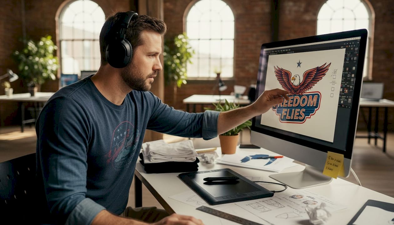
Before you touch a design file, you need to know exactly who you’re making this shirt for. Your audience shapes every decision that follows, from the colors you choose to the font style, graphic complexity, and even the placement of the print. A shirt designed for skateboarders in their twenties looks nothing like one made for yoga enthusiasts or small-town sports fans. Skipping this step is one of the most common reasons brands end up with generic designs that don’t connect with anyone.
Start by building a clear picture of your buyer. Think about their age range, interests, values, and how they typically dress. Once you have that picture, match your design style to it. The most popular approaches for small brands include:
- Minimalist: Clean lines, limited colors, and subtle graphics that feel modern and versatile
- Vintage: Distressed textures, retro color palettes, and nostalgic imagery that evoke a worn-in feel
- Statement: Bold text or graphic-forward designs that communicate a message or attitude directly
- Custom graphics: Original illustrations or brand-specific artwork that builds a unique visual identity
Research what’s actually selling in your niche. Browse competitor stores, check bestseller lists on platforms like Etsy or Amazon Merch, and pay attention to what gets engagement on social media. The goal isn’t to copy what works, but to understand the visual language your audience already responds to. You can find plenty of creative DTF design ideas to spark direction without losing your original voice.
Mood boards are underrated tools. Pull together images, color swatches, typography samples, and competitor designs that align with your vision. This gives you a reference point to check your own work against and keeps your design decisions consistent across a full product line.
Pro Tip: Don’t design for everyone. A focused niche audience will buy more consistently than a broad, undefined one. Specificity builds loyalty.
Perfect your artwork: Resolution and sizing essentials
Once you’ve identified your audience and style, it’s time to lock down the technical details that determine print clarity and consistency. This is where many independent designers stumble, not because they lack creativity, but because print production has rules that digital design doesn’t always make obvious.
The most fundamental rule is resolution. Your artwork should be at least 300 DPI (dots per inch) at the final print size. Anything lower and you risk pixelation, especially on larger prints. A design that looks crisp on your screen at 72 DPI will print soft and blurry on fabric. Always work at 300 DPI from the start rather than scaling up later.
Sizing is equally critical. Here’s a quick reference for recommended print sizes across common placements:
| Placement | Adult max size | Ladies/Youth max size |
|---|---|---|
| Full front or back | 12 x 12 in | 9 x 9 in |
| Left chest | 4 x 4 in | 3.5 x 3.5 in |
| Sleeve | 4 x 4 in | 3 x 3 in |
These aren’t arbitrary limits. Oversized prints on smaller garments look distorted and unprofessional. Undersized prints on adult shirts can look like an afterthought. Always adjust dimensions based on the specific garment you’re printing on.
For file formats, stick to the professional standard:
- AI or EPS: Vector files that scale infinitely without quality loss
- PSD: High-resolution layered files ideal for complex artwork
- PNG: Acceptable for DTF if exported at 300 DPI with a transparent background
The DTF design process guide breaks down how to set up your files specifically for DTF output, which has its own nuances compared to screen printing or embroidery. Understanding the DTF print workflow early saves you from costly file revisions later.
Pro Tip: Always design at the final print size, not at a reduced size you plan to scale up. Scaling up a raster file destroys resolution.
Select optimal print colors and placement
With artwork size and file setup covered, the next layer of polish comes from smart, strategic color and placement decisions. Color is one of the most powerful tools in apparel design, and also one of the easiest to get wrong when moving from screen to fabric.
For predictable color output, use Pantone or CMYK color systems rather than RGB. RGB is a screen-based color model and can produce colors that printers simply can’t replicate accurately. Pantone gives you a physical reference point; CMYK maps directly to how most printers mix ink. When in doubt, request a color proof before running a full production order.
Here’s a quick comparison of placement options and their typical use cases:
| Placement | Best for | Visual impact |
|---|---|---|
| Full front | Bold statements, large graphics | High |
| Left chest | Logo, subtle branding | Low to medium |
| Full back | Detailed artwork, event info | High |
| Sleeve | Accent branding, small graphics | Medium |
| Lower corner | Unique, editorial look | Low |
Color contrast between your design and the shirt fabric matters more than most people realize. A dark graphic on a dark shirt disappears. A light design on a white shirt can look washed out. Test your color combinations digitally first, then verify with a physical sample.
Classic pairings like black on white, white on navy, or red on gray consistently perform well because they’re readable from a distance and photograph cleanly for product listings. Explore how different t-shirt printing methods handle color differently, and consider how DTF vs screen printing compares for vibrant, multi-color designs.
Always scale appropriately for shirt sizes to maintain proportions across your size run. A design centered perfectly on a large shirt will shift visually on a small or XL without size-specific adjustments.
- Center prints horizontally on the chest, typically 3 to 4 inches below the collar
- Left chest logos should align with the heart side of the chest
- Sleeve prints should wrap no further than the natural curve of the arm
Check for printability: Quality assurance before production
After perfecting the design visually, your final safeguard is a methodical printability check before you send art to the press. This step catches the errors that cost you money and reputation.
Here’s a numbered pre-production checklist to run through every single time:
- Check for pixelation: Zoom to 100% in your design software. If it looks blurry at actual size, it will print blurry.
- Verify color contrast: View the design on a digital mockup of the actual shirt color. Adjust if elements blend into the background.
- Proofread all text: Spelling errors on a printed shirt are permanent. Read every word twice, then have someone else read it.
- Confirm dimensions: Cross-reference your design dimensions against the max print area for each garment size you’re ordering.
- Check bleed and margins: Make sure no critical design elements sit too close to the edge of the print area.
- Print a test transfer: Run a test on paper or a low-cost blank shirt before committing to a full run.
- Get a second opinion: Fresh eyes catch things you’ve become blind to after staring at a design for hours.
“Always adjust for garment size to maintain proportions. What looks balanced on an adult large can look completely different on a youth small.”
The DTF printing tips from experienced print shops emphasize that most production errors are caught at this stage, not during printing. Reviewing common DTF printing mistakes before you submit your order is one of the highest-return habits you can build as a small brand.
Pro Tip: Create a physical checklist document you print and sign off on before every order. It sounds old-school, but it forces you to slow down and actually verify each item instead of assuming everything is fine.
Why skipping the checklist is a costly mistake in t-shirt design
Here’s something we’ve seen play out repeatedly: a small brand rushes a design to production without running through a proper quality check, and ends up with 50 shirts they can’t sell. The print is off-center, the resolution is soft, or the color looks nothing like the mockup. They eat the cost, reprint, and lose weeks of momentum.
The instinct to skip the checklist usually comes from wanting to move fast. But speed without accuracy in apparel production doesn’t save time. It creates rework, refund requests, and reviews that follow your brand for months.
The uncomfortable truth is that a single bad batch can do more damage to your reputation than a slow launch ever would. Customers share photos of disappointing products. One viral complaint can undo months of brand-building.
A structured DTF transfer checklist isn’t bureaucracy. It’s the lowest-cost insurance policy available to any small apparel brand. The brands that grow consistently are the ones that treat quality control as a non-negotiable part of every single order, not something they do when they have extra time.
Take your t-shirt designs from idea to bestseller
You’ve done the work: defined your audience, set up your files correctly, dialed in your colors and placement, and run through a thorough quality check. Now it’s time to bring those designs to life with a print partner who can match your standards.
At Transfer Kingz, we specialize in high-quality DTF transfers built for small businesses and independent designers who can’t afford to compromise on print quality. Whether you’re based in Dallas and need fast local turnaround or you’re running a brand across Texas and need reliable statewide service, we have the capacity and expertise to support your next launch. No minimums, premium inks, and quick turnaround times mean your checklist-ready designs get to customers faster and looking exactly the way you intended.
Frequently asked questions
What is the best resolution for t-shirt artwork?
Artwork for t-shirts should be at least 300 DPI to ensure crisp, professional prints. Working at a lower resolution and scaling up will result in visible pixelation on the finished garment.
How big should my design be on an adult t-shirt?
The standard max size for an adult full front or back print is 12x12 inches. Scale down proportionally for ladies, youth, and smaller garment sizes to keep the design balanced.
Is it important to test print my t-shirt design before full production?
Test prints are essential for catching errors in color, resolution, and placement before you commit to a full run. A single test transfer can save you from reprinting an entire batch.
What mistakes should I avoid with t-shirt design files?
Avoid submitting low-resolution images, incorrect print dimensions, and designs with poor color contrast against the shirt fabric. These are the three most common causes of unsatisfactory print results.
Which file format is best for t-shirt printing?
Vector files like AI or EPS are ideal because they scale without quality loss. High-resolution PSDs at 300 DPI are also widely accepted and work well for complex, layered artwork.
0 comments