
TL;DR:
- Color management ensures consistent and accurate colors across devices and printed materials.
- It relies on calibration, ICC profiles, and proper color space choices to prevent unpredictable results.
Color management is the process that ensures colors appear consistent and accurate across every device, screen, and printed material in your workflow. Without it, the rich teal you designed on your calibrated monitor prints as a muddy blue, and your brand’s signature red looks different on every vendor’s output. For graphic designers, print professionals, and small business owners, understanding the role of color management is the difference between predictable results and expensive reprints. This guide covers how color management systems work, the real challenges you will face, and the color management best practices that produce consistent output in 2026.
What is the role of color management in professional workflows?
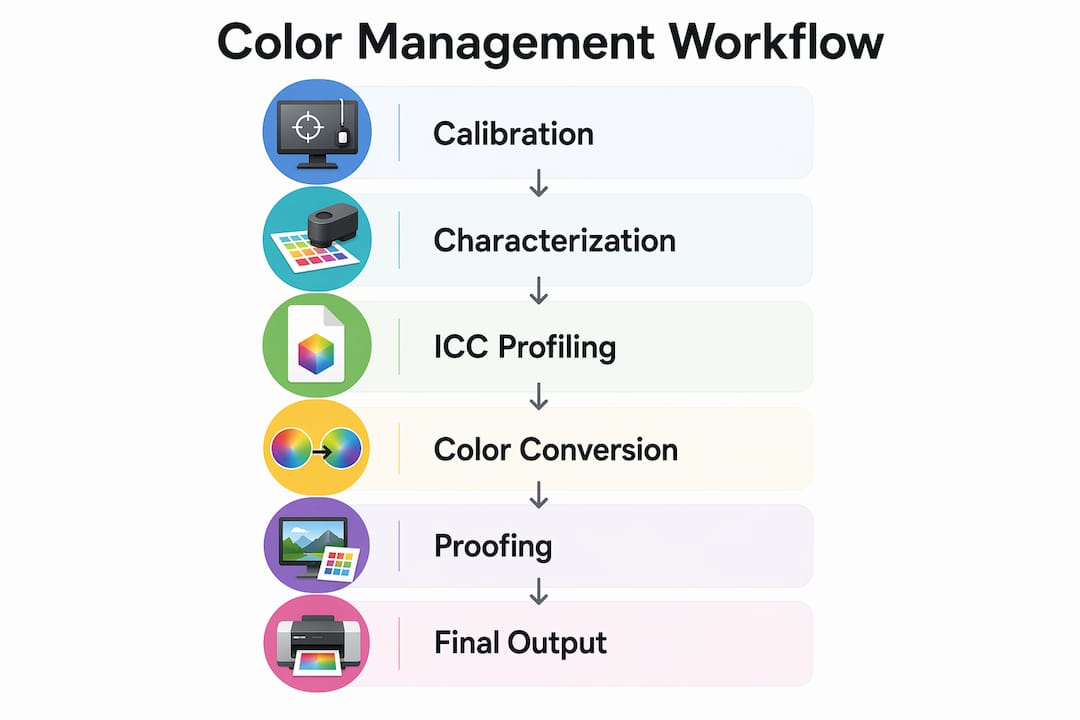
Color management is a system of tools, profiles, and standards that translates color data between devices so the final output matches the original creative intent. The industry term for this is a Color Management System, or CMS. Every device in your workflow, from your monitor to your RIP software to your press, sees color differently. A CMS acts as the referee.
The core components of any CMS are calibration, characterization, and conversion. Calibration brings a device to a known, stable state. Characterization creates an ICC profile that describes how that device reproduces color. Conversion uses those profiles to translate color values accurately from one device to another. Miss any one of these steps and your color pipeline breaks.
ICC profiles act as translators that keep color intent consistent from screen to press. They describe a device’s color attributes and allow software like Adobe Photoshop, Illustrator, or InDesign to perform accurate color conversions. Without embedded ICC profiles, your files carry no color context, and every device interprets them differently.
Color spaces define the range of colors a device can reproduce. The most common are sRGB, Adobe RGB, and CMYK. sRGB covers the range most monitors and web browsers display. Adobe RGB covers a wider gamut, making it better for print preparation. CMYK is the native space for offset and digital print presses. Choosing the wrong working space at the start of a project creates problems that compound at every stage.
Pro Tip: Set your working color space in Adobe Photoshop or Illustrator before you start any project. Changing it mid-workflow forces a conversion that can shift colors unexpectedly.
How Delta E measures color accuracy
Delta E is the numerical measurement of the difference between two colors as perceived by the human eye. Delta E values of ≤2 ensure professional-level color accuracy with near-imperceptible differences on monitors. Values between 2 and 3 are acceptable for general use but can show visible mismatches in skin tones or print output. For brand-critical work, a Delta E below 2 is the target.
Standard monitor calibration targets include a D65 white point and a brightness of 80–120 cd/m². D65 simulates average daylight and is the global standard for print and design work. Deviating from these targets means your monitor is showing you a version of your colors that no other device will replicate.
| Calibration Target | Standard Value | Purpose |
|---|---|---|
| White point | D65 | Matches daylight for print evaluation |
| Brightness | 80–120 cd/m² | Prevents over-bright or washed-out display |
| Delta E accuracy | ≤2 | Ensures near-imperceptible color difference |
| Recalibration frequency | Monthly | Accounts for monitor drift over time |
What challenges make color accuracy in design harder than it looks?
The biggest obstacle to color accuracy in design is the fundamental difference between how screens and printers produce color. Screens use additive color, mixing red, green, and blue light. Printers use subtractive color, mixing cyan, magenta, yellow, and black inks. These two systems have different gamuts, meaning the range of colors each can reproduce. Some colors on your screen simply cannot be printed. These are called out-of-gamut colors.
Effective color management is a mathematical approach to bridge the physical difference between emissive displays and reflective print media. That math breaks down when professionals skip steps or rely on uncalibrated equipment. Paper type, ink variability, and ambient lighting all introduce additional variables that no software can fully compensate for without a solid calibration foundation.
Soft proofing is the practice of simulating a print output on your monitor before sending a file to press. It sounds reliable, but soft proofing on an uncalibrated monitor is unreliable and may lead to incorrect approval of color corrections. You are essentially asking a broken ruler to measure something accurately. Calibrate first, then proof.
A common and costly mistake is confusing “assign profile” with “convert to profile” in Photoshop or Illustrator. Assigning an ICC profile changes how the software interprets the color values without recalculating them, which can cause visible color shifts. Converting transforms the actual color values mathematically to preserve the appearance. Use “assign” only when a file has no embedded profile and you know the correct source. Use “convert” when you need to move a file from one color space to another.
“Calibration is for designers to make decisions on accurate color, not to control how end-users see color on uncalibrated devices.” — Color Confidence
This distinction matters more than most designers realize. Your calibrated monitor gives you a trusted reference point for your own decisions. It does not guarantee your client sees the same thing on their laptop. Accepting that limitation is part of working professionally.
10-bit color workflows reduce banding and improve color fidelity in modern design. Increasing bit depth from 8-bit to 10-bit enables smoother gradients and more precise color representation, particularly in skies, skin tones, and subtle brand gradients. Monitors from manufacturers like EIZO, NEC, and BenQ offer 10-bit display support, and software like Adobe Photoshop supports 10-bit workflows on compatible hardware.
Additional challenges professionals encounter include:
- Paper white simulation: Leaving “Simulate Paper Color” unchecked during soft proofing ignores paper white, causing printed designs to appear denser or darker than expected.
- Ink variability: Different ink sets and substrates shift color output even with identical ICC profiles.
- Lighting conditions: Evaluating prints under non-standard lighting (anything other than D50 or D65) introduces visual errors that lead to unnecessary reprints.
- Profile mismatch warnings: Dismissing profile mismatch warnings in Adobe applications without understanding them is one of the most common sources of color errors in production.
How does the impact of color management on branding affect your business?
Poor color control costs real money. Consistent colors across brand assets prevent reprints and protect brand integrity, saving costs and enhancing client satisfaction. A single reprinted job can wipe out the margin on an entire order. For small business owners managing custom apparel or merchandise, that is a loss you cannot absorb repeatedly.
Brand color consistency is not just a design preference. It is a business standard. When a customer receives a t-shirt, a business card, and a banner from three different vendors, and all three show a different shade of the brand’s blue, trust erodes. The brand looks unprofessional, even if the individual products are well made.
The importance of color management shows up clearly in client relationships. Designers who can show a client a calibrated soft proof and then deliver a print that matches it build credibility fast. Designers who cannot explain why the print looks different from the screen lose clients. Color management is the technical foundation that makes those conversations go well.
For print professionals running production shops, color management reduces waste at scale. Consistent ICC profiles across multiple presses mean operators spend less time adjusting jobs and more time running them. That efficiency compounds across hundreds of jobs per month. For digital printing best practices in 2026, color consistency is a baseline expectation, not a premium feature.
What are the best practices for implementing color management?
Implementing color management well requires a repeatable process, not a one-time setup. Calibration should be a recurring practice integrated within the workflow. 80% of creative professionals use hardware calibration tools like colorimeters and spectrophotometers with monthly recalibration. Monthly recalibration accounts for the natural drift that occurs as monitor backlights age.
Follow these steps to build a reliable color management workflow:
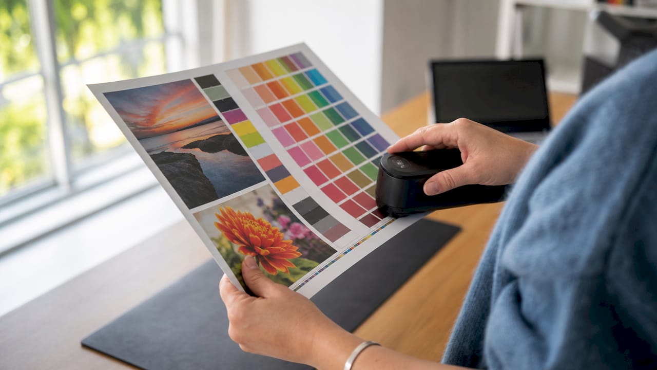
- Calibrate your monitor monthly using a hardware colorimeter such as the X-Rite i1Display or Datacolor Spyder. Software-only calibration is not sufficient for professional work.
- Set your working color space before starting any project. Use Adobe RGB for print work and sRGB for web or screen output.
- Embed ICC profiles in every file you send to a printer or client. A file without an embedded profile is a file waiting to be misinterpreted.
- Soft proof before printing using the printer’s ICC profile in Photoshop or InDesign. Always check “Simulate Paper Color” to see the realistic output.
- Evaluate prints under D50 lighting using a standard viewing booth from GTI or Just Normlicht. Overhead office lighting will mislead you every time.
- Audit your team’s monitors at least quarterly. One uncalibrated monitor in a shared workflow contaminates every decision made on it.
Pro Tip: When sending files to a DTF or digital print vendor, always ask which ICC profile they use for their press and substrate. Load that profile into Photoshop’s soft proof settings before you finalize your colors. What you see on screen will be much closer to what comes off the press.
Calibration tools worth knowing
| Tool | Type | Best For |
|---|---|---|
| X-Rite i1Display Pro | Colorimeter | Monitor calibration for designers |
| Datacolor Spyder X Pro | Colorimeter | Budget-friendly monitor profiling |
| X-Rite i1Pro 3 | Spectrophotometer | Press and printer profiling |
| X-Rite ColorChecker | Color target | Camera and scanner profiling |
Designers often underestimate the importance of early color decisions rather than delaying conversion until final export. Choosing your color space and embedding your profile at the start of a project prevents the compounding errors that make late-stage corrections so painful. Build color management into your project setup checklist, not your export checklist. For a full workflow optimization checklist, the steps above integrate directly into a production-ready process.
Key Takeaways
Color management is the technical foundation that connects creative intent to accurate, consistent output across every device and print medium in your workflow.
| Point | Details |
|---|---|
| ICC profiles are non-negotiable | Embed ICC profiles in every file to prevent color misinterpretation across devices and vendors. |
| Delta E ≤2 is the accuracy target | Professional color work requires a Delta E below 2 for near-imperceptible color differences. |
| Calibrate monthly, not once | Monitor drift is real; monthly recalibration with a hardware colorimeter maintains a trusted reference. |
| Soft proofing requires calibration first | Soft proofing on an uncalibrated monitor produces false confidence and leads to incorrect print approvals. |
| Early color decisions prevent late errors | Set your working color space and embed profiles at project start, not during final export. |
Color management is a skill, not a setting
After years of working with designers and print shops, the pattern I see most often is this: professionals treat color management as a one-time configuration rather than an ongoing discipline. They calibrate their monitor once when they buy it, never touch it again, and then wonder why their prints drift over time.
The uncomfortable truth is that most color problems I encounter are not caused by bad equipment. They are caused by skipped steps. A $3,000 EIZO monitor running on a two-year-old profile is less reliable than a $400 BenQ monitor calibrated last week. The tool matters less than the habit.
What I find most designers miss is the purpose of calibration. Calibration gives you a trusted reference for your own decisions. It does not fix what your client sees on their phone. Once you accept that distinction, you stop chasing perfection on the output side and start building a reliable process on your side. That shift in thinking changes everything.
The future of color management is moving toward wider color gamuts with Display P3 and Rec. 2020 becoming standard on consumer devices, and HDR workflows entering the design mainstream. If you are not already thinking about how your color management process handles these wider spaces, 2026 is the year to start. The professionals who build that foundation now will spend far less time correcting problems later.
— Anthony
Transferkingz delivers color accuracy with every DTF print
Consistent color is not just a workflow problem. It is a production problem. Transferkingz uses calibrated color management processes in its Direct-to-Film printing to deliver vibrant, accurate results on every order, whether you are printing one transfer or a full gang sheet.
For designers and small business owners who need prints that match their files, Transferkingz offers custom DTF printing in Dallas with no minimum order requirements and fast turnaround. The process is built around premium inks, quality films, and a color workflow designed to reproduce your artwork accurately on fabric. If you want prints that look like your design, not like a guess, Transferkingz is where to start. Explore DTF color accuracy to see how the process works before you order.
FAQ
What is color management in simple terms?
Color management is a system that ensures colors look consistent across different devices and printed materials. It uses ICC profiles, calibration, and color space standards to translate color data accurately from screen to print.
Why does my print look different from my screen?
Screens use additive light (RGB) and printers use subtractive ink (CMYK), so they reproduce color differently. Without a calibrated monitor and proper ICC profiles, the gap between what you see and what prints can be significant.
How often should I calibrate my monitor?
Monthly recalibration is the professional standard. Monitor backlights drift over time, and a profile that was accurate six months ago may no longer reflect your display’s actual output.
What is a Delta E value and why does it matter?
Delta E measures the visible difference between two colors. A Delta E of ≤2 is the target for professional color work, meaning the difference is near-imperceptible to the human eye.
What is the difference between assigning and converting an ICC profile?
Assigning a profile changes how software interprets color values without recalculating them, which can shift colors visibly. Converting transforms the actual color values mathematically to preserve the intended appearance across color spaces.
0 comments