

TL;DR:
- Vibrant prints rely on precise color science, high-quality printing technology, and deliberate design choices to produce bold, lively visuals. They involve high saturation, contrast, and careful color management across RGB and CMYK workflows to ensure vividness on various surfaces. Using proper techniques like white underbases on dark fabrics and optimized file prep, you can achieve long-lasting, eye-catching designs across fashion and decor items.
Vibrant prints are one of those terms that gets thrown around constantly in fashion, design, and crafting circles, yet rarely gets a real explanation. Most people assume it just means “bright colors,” but that’s only part of the picture. What are vibrant prints, really? They’re the result of precise color science, quality printing technology, and deliberate design decisions working together. Whether you’re decorating custom apparel, designing fabric patterns, or creating wall art, understanding what actually makes a print vibrant gives you a real edge in producing work that genuinely pops off the surface.
Table of Contents
- Key takeaways
- What are vibrant prints: the color science explained
- Characteristics and examples of vibrant prints
- Printing techniques that produce vibrant results
- How to use vibrant prints in creative projects
- Common pitfalls that kill print vibrancy
- My take on what vibrant prints actually require
- Get vibrant, production-ready DTF transfers from Transferkingz
- FAQ
Key takeaways
| Point | Details |
|---|---|
| Vibrancy is more than brightness | High saturation, contrast, and chroma together create vibrant prints, not just loud colors. |
| Color mode matters | Working in RGB and converting carefully to CMYK preserves color fidelity and avoids washed-out results. |
| File prep directly affects output | 300 DPI resolution, correct color profiles, and uncompressed formats are non-negotiable for vibrant results. |
| White underbase is critical | On dark garments, an insufficient white underbase kills color intensity regardless of file quality. |
| DTF is a top method for vibrancy | Direct-to-Film printing delivers sharp edges, rich color layering, and durable results on most fabric types. |
What are vibrant prints: the color science explained
Most people think vibrancy equals brightness. It doesn’t. Vibrancy in print is about saturation and chroma. Saturation describes how pure or intense a color is at full hue strength. A saturated red looks like fire. A desaturated red looks pink or muddy brown. Chroma takes that a step further by measuring the colorfulness of a hue relative to white under the same lighting. Together, these two properties determine whether a print reads as alive or flat.
Here’s where it gets technically interesting. Your computer monitor works in RGB (Red, Green, Blue), an additive color model that produces colors through light. Printers work in CMYK (Cyan, Magenta, Yellow, Black), a subtractive model using physical inks. The CMYK color gamut is smaller than what RGB screens can display, which means those electric blues and neon greens you see on screen often print significantly duller. This is not a flaw in printing; it’s a physical limitation of ink on substrate.
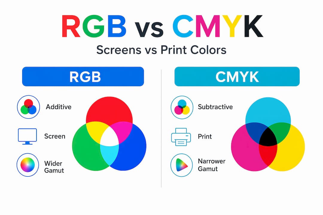
| Property | RGB | CMYK |
|---|---|---|
| Color model | Additive (light) | Subtractive (ink) |
| Use case | Screen display | Physical printing |
| Color gamut | Wider, more vivid | Narrower, ink-limited |
| Vibrancy risk | Appears very saturated | Can lose intensity in conversion |
| Best practice | Design in wide-gamut RGB | Convert to CMYK carefully, late in workflow |
Context also shapes perception. The same saturated color reads as electric against a neutral gray background but almost flat against a similarly saturated neighbor. This is why vibrant print designs always consider surrounding colors, not just the colors in the motif itself.
Characteristics and examples of vibrant prints
Understanding what vibrant prints look like in practice helps you recognize and replicate them. Vibrant floral digital fabrics are one of the clearest examples: bright pink, coral, and orange flower motifs with sharp stroke edges, smooth gradient transitions between petals, and no color bleeding or muddiness at the boundaries. That clarity is not accidental. It comes from high-definition printing processes and well-prepared digital files.
Common features of vibrant print designs include:
- High chroma colors such as electric blue, coral red, vivid yellow, and deep magenta
- Sharp, well-defined motif edges that prevent color bleed and keep patterns crisp
- Smooth gradient transitions that show depth without banding or stepping artifacts
- Bold, high-contrast pattern pairings like floral against a dark background or geometric shapes on white
- Minimal halftoning artifacts that would otherwise dull fine detail areas
- Consistent ink density across the full print area with no fading patches
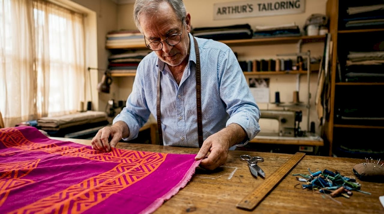
The base material plays an enormous role too. Vibrant statement prints on a magenta or bright orange base fabric look exponentially more alive than the same design on an off-white or beige background. The base color acts as part of the design, either amplifying or suppressing the printed colors on top of it.
Vibrant prints aren’t limited to clothing. Textile art and wall decor use saturated, high-contrast patterns to create visual weight and energy in a space. Tapestries, decorative pillows, and printed canvas art all rely on the same principles of chroma and contrast to command attention in a room.
Printing techniques that produce vibrant results
Not every printing method is built for vibrancy. Screen printing, for example, excels at bold, flat color blocks but struggles with photo-realistic gradients. Sublimation printing produces stunning color depth on synthetic fabrics but doesn’t work on natural cotton. DTF and DTG printing use CMYK ink layering to produce bright, highly detailed full-color prints on almost any garment, making them the most flexible options for achieving vibrant results consistently.
For vibrant prints in fashion specifically, DTF (Direct-to-Film) stands out because it transfers a full-color design through a heat press, laying down pigment on a bright film layer first. That film acts as a white underbase and color carrier simultaneously, which is why DTF prints stay sharp and colorful even on dark garments.
Here’s a practical workflow for maximizing vibrancy from file to finished print:
- Design in a wide-gamut RGB color space such as Adobe RGB or Display P3 to access the broadest range of colors during creation
- Use 300 DPI resolution for all raster elements to preserve detail and avoid pixelation at print size
- Avoid compressed file formats like JPEG for final export; use PNG or TIFF to prevent color degradation
- Convert to the correct CMYK profile late in the workflow, after design decisions are finalized, to minimize color shift
- Check for out-of-gamut colors using your software’s soft-proof or gamut warning feature before exporting
- Calibrate your monitor and printer using appropriate ICC color profiles to keep what you see consistent with what prints
- Run a test print on the actual substrate before committing to a full production run
Pro Tip: Always print a small sample on the exact fabric or material you plan to use for the final job. Colors shift differently on cotton versus polyester versus canvas, and no amount of screen calibration substitutes for a real-world test print.
How to use vibrant prints in creative projects
Knowing what vibrant prints are is one thing. Using them well in actual projects takes a different skill set. The biggest mistake most beginners make is treating vibrancy as an isolated quality, piling on saturated colors without considering how they interact with each other and with the finished product’s context.
Start with your palette. Complementary color pairs like blue and orange or red and green sit opposite each other on the color wheel and generate maximum visual contrast. That contrast is what the eye reads as energy and vibrancy. Using only analogous colors (neighbors on the wheel) creates harmony but rarely the punch that vibrant prints deliver.
Think about print scale in relation to the garment or object. A large-scale floral on a crop top reads completely differently than the same print scaled down on a tote bag. Scale also affects how colors blend at viewing distance. Fine detail at a small scale can look muddy from three feet away, while bold, simple motifs hold their vibrancy even at distance.
A few practical pointers for working with vibrant prints in fashion and crafting:
- Choose lighter base fabrics when possible; a white or light gray cotton will show off vibrant DTF or DTG prints far more faithfully than a dark substrate
- Balance vibrant print areas with solid neutrals in the same outfit or design to give the eye a place to rest
- Scale your print motifs intentionally for the finished size of the product, not just how they look on screen
- Consider garment construction when placing prints so seams and folds don’t interrupt key design elements
Pro Tip: When designing for apparel, place your most visually impactful motif at chest height or centered on the back. These are the first zones the eye travels to, so your strongest color combinations should live there.
Durability connects directly to vibrancy over time too. Wash fastness, UV exposure, and fabric care all erode print color. For apparel, understanding print longevity practices early in your design process helps you choose materials and printing methods that stay vibrant through real-world use.
Common pitfalls that kill print vibrancy
The most frustrating print experience is finishing a job and watching a design that looked incredible on screen come out flat, muddy, or faded. These mistakes are almost always avoidable.
- Converting RGB to CMYK too early in your workflow locks in color decisions before you’re done designing, leading to perceived dullness in areas that should sing
- Skipping the white underbase on dark garments is arguably the single biggest vibrancy killer. Insufficient white underbase makes colors appear washed out even when your file is technically perfect
- Using low-quality inks or mismatched ink profiles produces color banding, weak saturation, and inconsistent hue across the print area
- Saving files as compressed JPEGs introduces artifacting that shows up as subtle blurring around color transitions, muting the sharpness that makes vibrant prints feel alive
- Ignoring device calibration means the gap between what you see and what prints keeps widening over time as your monitor and printer drift from their baseline profiles
Pro Tip: Before any major print run, do a three-step check: calibrate your monitor against a physical color reference card, run a test print on a scrap piece of your actual substrate, and compare the two side by side under consistent lighting. Fix your workflow, not the artwork.
My take on what vibrant prints actually require
Working in this space, I’ve seen a consistent pattern: people invest in great artwork and then undermine it at the technical stage. The design might be genuinely stunning on screen, but because the file prep or printing workflow wasn’t handled carefully, the finished product looks like a pale copy of the original vision.
What I’ve found is that vibrancy is not a property you add at the end. It’s built into every decision from the first color choice in your design software to the substrate you print on. The designers I’ve watched produce consistently striking work don’t chase brightness. They manage contrast, maintain clean edges, and understand that a single neutral in the design often makes every surrounding color read as more intense.
The other thing most articles won’t tell you: the printing method matters more than the artwork for certain types of vibrancy. You can have a mediocre design printed through a well-calibrated DTF process on quality film and it will look better than brilliant artwork printed on the wrong machine with generic inks. The execution layer is not secondary. It’s equal to the creative layer.
My encouragement: stop treating technical file prep as a chore and start treating it as part of the design process. The moment you understand color profiles and resolution as creative tools rather than box-checking tasks, your prints will improve immediately and obviously.
— Anthony
Get vibrant, production-ready DTF transfers from Transferkingz
Transferkingz specializes in exactly the kind of print quality this article has been breaking down. Their custom DTF printing services use premium pigment inks, calibrated film, and precision printing equipment built to reproduce high-chroma designs with sharp edges and consistent color across every transfer. Whether you’re a small apparel brand, a crafter working on one-off pieces, or a production shop processing hundreds of items, Transferkingz handles orders with no minimums and fast turnaround times. Their process is designed so your artwork gets from file to finished garment with as little color loss as possible, keeping your vibrant print designs looking exactly the way you intended them. If you’ve been settling for dull or inconsistent results elsewhere, it’s worth seeing what properly executed DTF transfers actually look like.
FAQ
What are vibrant prints in simple terms?
Vibrant prints are designs characterized by high color saturation, strong contrast, and sharp detail that make patterns appear vivid and visually intense on fabric or other surfaces.
What makes a print vibrant versus just bright?
Brightness refers to how light a color is, while vibrancy combines high chroma and saturation with contrast. A vibrant print uses colors at full hue intensity paired with strong contrast to create visual energy.
What are the best examples of vibrant prints?
Common examples of vibrant prints include bold tropical florals, high-contrast geometric patterns, and detailed paisleys printed on light or brightly colored fabric bases using digital printing methods.
Why do vibrant prints look different on screen versus in person?
CMYK ink has a smaller color gamut than RGB screens, so highly saturated colors you see digitally may print less intensely. Proper color profile management and test prints minimize this gap.
Which printing method is best for vibrant prints on fabric?
DTF printing is one of the most reliable methods for vibrant prints on fabric because it lays color on a film base with a built-in underbase, producing bright, durable results on virtually any garment type.
0 comments