
TL;DR:
- Vibrant color printing employs expanded gamut inks beyond standard CMYK to create richer, more vivid images that reflect branding accurately. Proper color management, including CMYK design, ICC profiles, and proofing, ensures color fidelity from digital file to final product. Modern technologies like UV curable and six-color expanded gamut printing significantly enhance visual impact, boosting small business branding and customer satisfaction.
Most people assume all printing is essentially the same: you upload a file, a machine puts ink on material, and you get a product. That assumption costs small business owners and artists real money. What is vibrant color printing, exactly, and why does it matter? It is a category of printing that goes beyond standard four-color methods to produce richer, more intense colors that genuinely reflect your brand’s personality. If your custom apparel or merchandise looks washed out next to a competitor’s product on the same shelf or screen, the difference almost certainly comes down to printing quality and color method.
Table of Contents
- What is vibrant color printing and how does it differ from standard printing?
- Understanding color models: CMYK vs RGB and the role of ICC profiles
- Modern vibrant printing technologies and techniques for custom apparel
- How to apply vibrant color printing to boost your custom apparel business
- Common challenges and expert tips for mastering vibrant color printing
- Why vibrant color printing is a game-changer for small businesses and artists
- Explore Transfer Kingz’ custom vibrant printing solutions
- Frequently asked questions
What is vibrant color printing and how does it differ from standard printing?
Standard printing uses the CMYK color model: cyan, magenta, yellow, and black. Four ink plates combine to reproduce thousands of colors. The problem is that CMYK has a ceiling. Certain vivid oranges, deep greens, and saturated pinks simply fall outside what four inks can faithfully reproduce. The result is a printed color that looks flatter than the original design.
Vibrant color printing pushes past that ceiling. As six-color processes show, adding dedicated orange and green inks to the standard CMYK set expands the color gamut significantly, producing more accurate skin tones and packaging colors that actually command attention on a shelf or product page. For custom apparel, that difference is visible from ten feet away.
Here is what sets vibrant color printing apart from standard methods:
- Expanded color gamut: Extra ink channels reproduce colors that four-color CMYK cannot hit
- Richer skin tones: Critical for artists printing portrait-based designs or beauty brands
- Higher saturation: Bright reds, electric blues, and vivid greens stay vivid rather than muddying
- More nuanced gradients: Smooth transitions between colors without visible banding
- Broader material compatibility: Works effectively on textiles, merchandise, and promotional products
For artists working in print and digital graphic design, understanding these distinctions before sending files to a printer saves enormous rework time. The gap between what your monitor shows and what ships to your customer narrows considerably when the printer is working with an expanded ink set.
“The question is not whether your design is good. The question is whether your printing method can carry it.”
Pro Tip: When requesting a print quote, ask specifically whether the printer supports expanded gamut printing or six-color processes. If they only offer standard CMYK, your vivid gradients and bright brand colors may not survive the process.
Designers who want to fully understand how advanced color printing processes interact with fabric and film will find that matching the right printing method to the right substrate is the real skill.
Understanding color models: CMYK vs RGB and the role of ICC profiles
Having defined vibrant color printing, let’s explore the underlying color models and color management systems that affect how vibrant your prints look on apparel and merchandise.
RGB (red, green, blue) is the color model your monitor, phone, and camera use. It is additive, meaning it creates color by combining light. The more color you add, the brighter the result gets. CMYK works the opposite way. It is subtractive, meaning inks absorb (subtract) certain wavelengths of light. More ink typically means darker, not brighter. This is the root cause of most print disappointments.
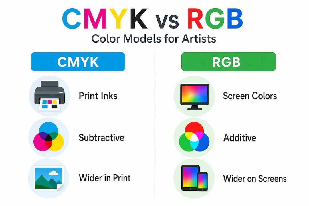
When designers build files in RGB, colors look electric on screen. The moment those files hit a CMYK printer, CMYK subtracts light and produces tones that are noticeably duller than what the screen showed. Designing in CMYK mode from the start lets you see an approximation of the final printed result before anything goes to production.
Here is a step-by-step approach to managing color for vibrant print results:
- Set your document to CMYK mode in your design software before you create a single element
- Assign the correct color profile for your printer and paper type (typically US Web Coated SWOP or a printer-supplied profile)
- Check for out-of-gamut colors using your software’s gamut warning tool and adjust before sending files
- Embed an ICC profile in your exported file so the printer’s system knows exactly how to interpret your color data
- Export as PDF/X-1a or PDF/X-4 to preserve embedded color profiles and prevent ripping software from guessing your intent
- Request a physical proof before full production runs, especially for brand colors that must stay consistent across products
Without proper ICC profiles, color shifts occur during the handoff between your design file and the printer’s output. Embedding profiles in PDF/X standards is not optional for serious merchandise production. It is the difference between a proof that matches the final run and a batch that looks like a different colorway entirely.
Pro Tip: If your printing partner provides a custom ICC profile for their equipment, install it and assign it to your document. Generic profiles are a fallback, not a target.
“Color management is invisible when it works perfectly and catastrophically visible when it fails.”
Understanding color accuracy and management becomes non-negotiable once you start scaling merchandise production past a handful of units. For a deeper look at why design matters to small business outcomes, the connection between design quality and customer trust is well established.
Modern vibrant printing technologies and techniques for custom apparel
With a grasp of color theory and management, let’s look at the modern printing technologies that bring vibrant colors to life on custom apparel and merchandise.
Two technologies matter most for small business owners right now: UV printing with curable inks and six-color expanded gamut printing. Each has a specific use case and a specific cost profile.
UV printing uses ultraviolet light to instantly cure (harden) ink as it leaves the print head. UV curable inks achieve instant drying, which eliminates the waiting and smearing problems associated with traditional wet inks. For a small business managing tight turnaround windows, this is significant. You can print, cure, and ship within the same production window.
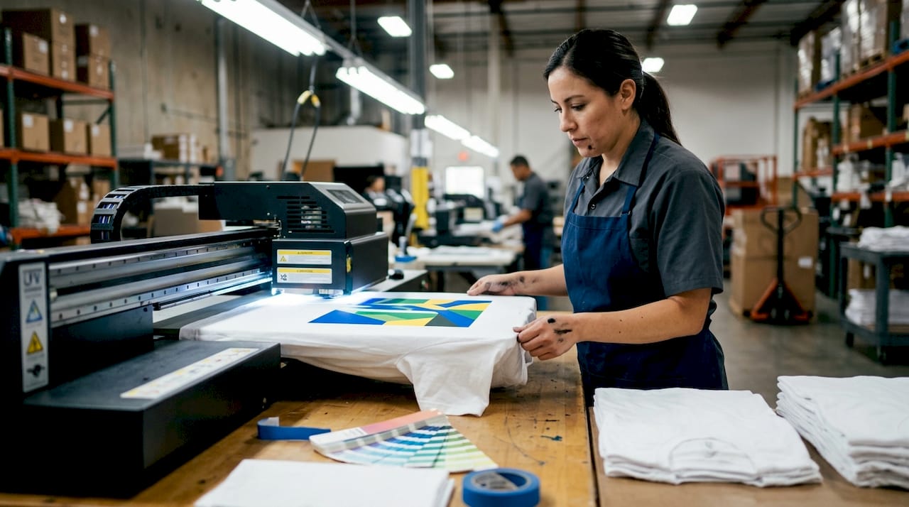
UV printing also enables a critical technique for dark fabrics: a white ink underbase. The printer lays down an opaque white layer first, then prints color on top of it. The result is colors that pop on black or navy material rather than being absorbed by the dark fibers beneath them.
Six-color expanded gamut printing takes the CMYK base and adds orange and green channels. Swapping to PMS orange and green inks cuts color matching time by 40% and dramatically widens the printable color range, though it performs best on coated paper at 300 DPI or higher. For apparel mockups and product labels, this is a meaningful quality jump.
Key factors that influence print vibrancy beyond ink type:
- DPI (dots per inch): Higher DPI means finer detail and smoother color gradients
- Substrate coating: Coated materials hold ink on the surface; uncoated materials absorb ink and reduce saturation
- Ink freshness: Aged or poorly stored inks shift color over time
- Print head calibration: Even premium inks produce muddy results on a misaligned machine
| Factor | Standard CMYK | Six-color expanded gamut |
|---|---|---|
| Color range | Moderate | Significantly wider |
| Skin tone accuracy | Limited | Noticeably better |
| Cost per unit | Lower | Moderately higher |
| Color matching speed | Slower | ~40% faster |
| Best substrate | Uncoated or coated | Coated, 300 DPI minimum |
| Dark material performance | Poor without underbase | Strong with white underbase |
| Drying method | Air or heat | UV instant cure |
Pro Tip: Before investing in a full production run, request a printed strike-off (a physical test print on your actual substrate). Screen previews are useful but never definitive.
You can explore more about UV DTF printing benefits and compare textile printing methods to find the right fit for your product line.
How to apply vibrant color printing to boost your custom apparel business
Now that you understand the options and technologies, here is how you can strategically apply vibrant color printing to elevate your merchandise and grow your business.
The practical application comes down to four areas: file preparation, method selection, proofing, and iteration.
File preparation checklist:
- Build your design in CMYK mode from the beginning
- Set document resolution to 300 DPI minimum (400 DPI for fine-detail designs)
- Convert all RGB images before placing them in your layout
- Embed your ICC profile before export
- Flatten transparencies and outline all fonts
- Export as PDF/X-1a for maximum compatibility
Method selection:
- Low-volume, high-detail runs: UV DTF printing with expanded gamut inks
- High-volume runs with consistent brand colors: six-color offset or direct-to-garment
- Dark apparel: any method that supports white ink underbase
Proofing:
- Always request a physical proof for new designs
- Review proofs under both daylight and indoor lighting (colors shift under different light sources)
- Compare the proof to your on-screen design with calibrated monitor settings
Upgrading from four-color to six-color printing has been shown to increase re-order rates for product lines where color accuracy matters, like beauty and lifestyle brands. The mechanism is simple: customers who receive a product that looks exactly like the website photo are far more likely to buy again.
Pro Tip: Build a printed color reference card for your most-used brand colors. Send it to every print partner as a physical benchmark. This eliminates “close enough” interpretations that erode brand consistency over time.
Benefits you will notice after switching to vibrant printing:
- Higher customer satisfaction scores on product reviews
- Fewer returns and complaints about color mismatch
- Stronger visual impact in flat-lay product photography
- Greater willingness from customers to pay a premium price point
Your DTF vibrant printing guide and high-quality DTF ink tips will give you a clear framework for applying these principles specifically to custom apparel.
Common challenges and expert tips for mastering vibrant color printing
With practical application covered, let’s discuss the common hurdles you might encounter and expert advice to ensure your vibrant prints succeed every time.
The most common issue small businesses report is color mismatch: the printed product looks noticeably different from the approved digital design. The culprit is almost always one of three things: designing in RGB without converting to CMYK, missing or incorrect ICC profiles, or a printer using equipment that has not been calibrated recently.
Common pitfalls and their solutions:
- RGB files sent to a CMYK printer: Convert all elements to CMYK before submission; never rely on the printer’s software to convert accurately
- Missing ICC profiles: Always embed profiles; request the printer’s specific profile and assign it before export
- Over-curing UV white ink: White ink as opaque base requires careful calibration to avoid brittleness; work with printers who track cure times precisely
- Wrong substrate: Some fabrics and coatings absorb ink unpredictably; always test on your actual material before committing to a run
- Outdated equipment: Ink delivery systems degrade over time; ask printers about their maintenance schedule
- Proofing only under one light source: Metamerism means colors that match under LED lighting can clash under fluorescent; always proof under at least two light types
“The gap between what you designed and what shipped is rarely a design problem. It is almost always a color management problem.”
Pro Tip: Keep a physical proof from every approved production run. When you reorder the same product six months later, use it as your color benchmark rather than your monitor. Monitors drift. Paper does not change.
Maintaining color accuracy tips as a living reference in your production workflow will save you from having to diagnose the same problems repeatedly.
Why vibrant color printing is a game-changer for small businesses and artists
Here is the conversation most printing articles skip entirely. Vibrant color printing is not just a technical upgrade. It is a brand positioning decision.
Color is more than ink; it functions as a communication tool, an emotional trigger, and a branding signal. When a customer picks up your t-shirt and the color looks exactly as vivid as it did on the product page, something happens that goes beyond satisfaction. They trust you more. And trust converts to repeat purchases, referrals, and a premium price tolerance that no amount of discounting can build.
The brands that invest in print quality early tend to build something that discount-first competitors cannot easily replicate: a reputation for products that look as good in person as they do in photos. That gap between expectation and reality is where most customer churn lives.
There is also a tactile dimension most articles ignore. Vibrant printing combined with finish options like soft-touch varnish or raised textures creates a multi-sensory impression. The color says “buy me,” and the feel confirms it. For independent artists especially, this transforms a printed product from a commodity into an object worth collecting.
The honest truth is that most small businesses treat printing as a cost to minimize rather than a variable to optimize. That framing is backwards. A 15% increase in print quality can justify a 30% increase in retail price. The math works. The businesses that figure this out early build margin advantages that compound over time. The ones that keep chasing the cheapest printer per unit spend that same time managing customer complaints and returns.
Explore Transfer Kingz’ custom vibrant printing solutions
If you’re ready to bring the vibrant printing techniques discussed here to your custom products, Transfer Kingz offers reliable services tailored to your needs.
Transfer Kingz specializes in DTF transfers built with premium expanded-gamut inks designed to produce the vivid, consistent colors this article describes. Whether you are printing a single custom design or building a product line for retail, their process supports white ink underbases, high-DPI output, and fast turnaround without minimum order requirements.
Explore custom DTF printing services in Dallas or browse DTF printing services in Texas to find a production option that fits your timeline and goals. You can also check out their print point services to understand the full range of custom printing solutions available for small businesses and independent artists ready to invest in color quality that actually holds up.
Frequently asked questions
What exactly is vibrant color printing?
Vibrant color printing uses expanded color inks beyond standard CMYK, often adding orange and green channels, to produce richer, more vivid prints that stand out on apparel and merchandise. It is the method that closes the gap between what you see on screen and what arrives in a customer’s hands.
Why should I design in CMYK mode for printing vibrant colors?
Designing in CMYK ensures your colors are built for inks that subtract light, which prevents dull or unexpected results in the final product. Starting in CMYK mode avoids the color shock that comes when RGB files hit a four-color press.
How do ICC profiles help with vibrant color printing?
ICC profiles translate color data between your design software and the printer’s hardware, keeping colors accurate across devices. Embedding ICC profiles in your print-ready files prevents the color shifts that turn vivid designs into disappointing products.
What are the benefits of UV printing with curable inks for custom apparel?
UV printing instantly cures inks with ultraviolet light, enabling fast turnaround, reduced waste, and the ability to print vibrant colors on dark fabrics using a white underbase. UV curable inks achieve instant drying, which is a significant operational advantage for small business production schedules.
How can small businesses overcome common challenges in vibrant color printing?
Use ICC profiles, design in CMYK from the start, proof prints under multiple light sources, and choose substrates tested for your specific ink type. White ink calibration is especially important when printing on dark apparel to avoid brittleness and ensure color accuracy.
0 comments